Our photography business used to carry my name. That was fine, until it wasn’t. This is part 2 of the Dangtastic Shots story: how we got a new name, one style for two very different kinds of photography, and a heart that is tilted on purpose.
Why the name had to change
My wife Cinzia and I run the business together. But the business was called Mark Dang Photography. So when a client wanted to book Cinzia, they would be booking “Cinzia from Mark Dang Photography”. That never sounded right.
The new name is built on the last name we share: Dang. “Book Cinzia from Dangtastic Shots” simply makes sense, and so does booking me. The name belongs to both of us.
Two worlds, one style
We photograph two very different things: weddings and boudoir. In the past, both had their own look. That worked at the time, but it also meant our work could look like it came from two separate companies.
I wanted one recognisable style that fits both worlds, so that whatever you see from us, you know it is ours. That does not mean everything looks the same. Boudoir has always had a darker, moodier look on our site, and it still does. It is the same brand, just with the lights dimmed.
The heart
The center of the new brand is a heart. It works on several levels:
- Our love for photography, which is why we do this at all.
- Weddings, which hardly need explaining.
- Boudoir, where it stands for loving yourself the way you are.
In the logo, the heart replaces the dot after the name, and that same heart comes back everywhere in the brand.
Why it is tilted
A straight “D with a heart” is the first thing anyone would think of. That also makes it easy to copy, and easy to confuse with someone else. So our heart is tilted by 10 degrees, and it is a little bit asymmetric. Small details, but they make it ours, and harder to imitate.
I will admit it also fits my personality. I like most things a little less straightforward.
Red, but not pink
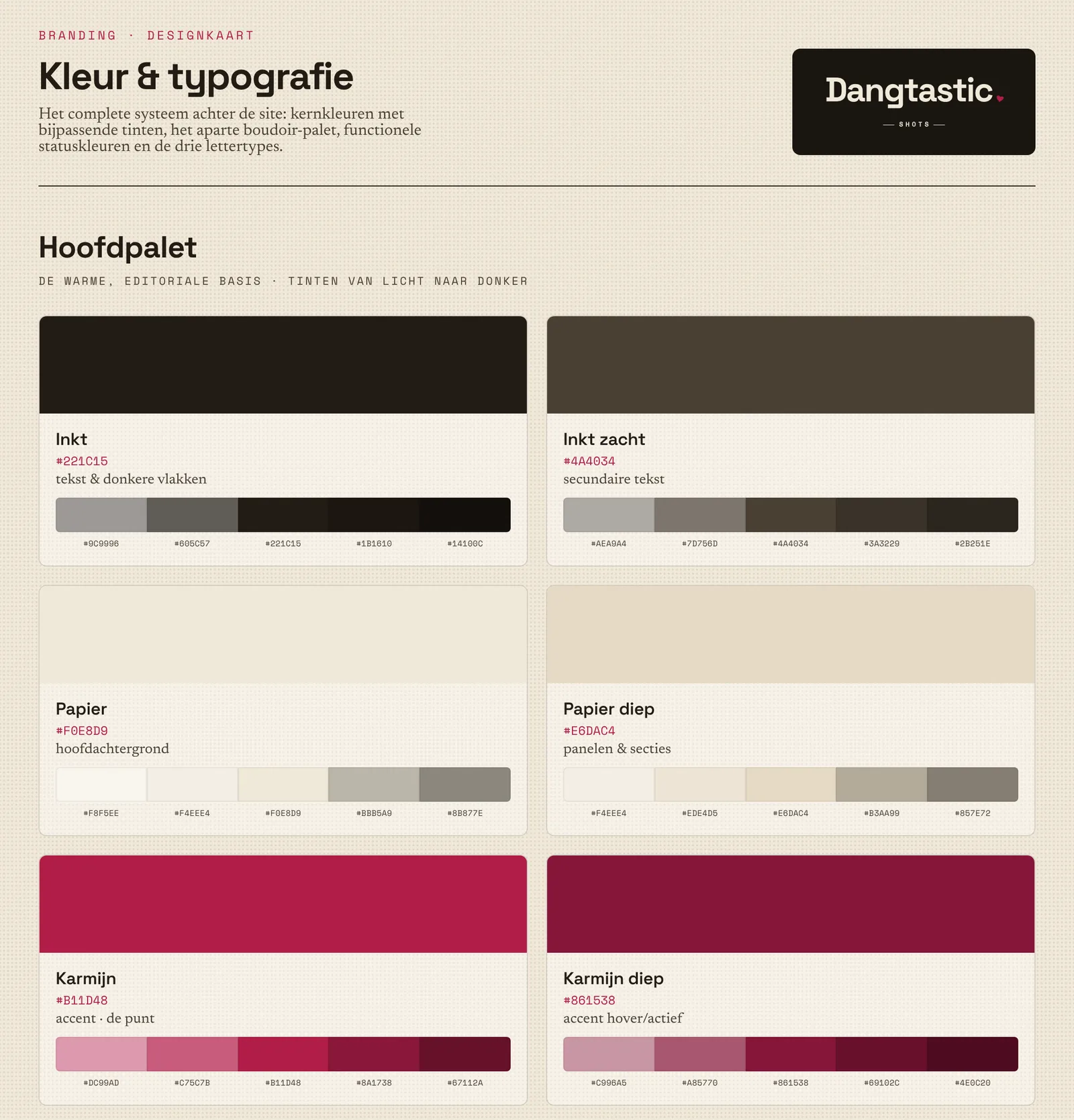
For the main color we wanted red, but not something that tips over into pink. We ended up with a deep carmine, with a deeper shade and a softer rosé next to it, and ink, cream and a dark aubergine to balance it out:
| Color | Hex |
|---|---|
| Carmine | #B11D48 |
| Deep carmine | #861538 |
| Carmine rosé | #CC6E86 |
| Ink | #221C15 |
| Cream | #F0E8D9 |
| Aubergine | #1E1419 |
The fonts each have their own job: Space Grotesk for headings and the logo, Newsreader in italics for warm accents, and Space Mono for small labels.
More than a logo
A brand only works if it shows up everywhere, so everything the business sends out got the same treatment:
- Quotes, invoices, letterhead, price lists and gift vouchers as templates that open in the browser, get filled in and are printed to PDF
- An email signature and watermarks for our photos, in rosé, mono and ink
- Instagram carousels and stories, in both the light and the boudoir style
- Confirmation emails for bookings, styled like the website
- A tone of voice guide, so everything we write sounds like us. It doubles as context for AI writing tools.
Lessons
- Name the business for the people in it. A name that fits everyone who works there makes every conversation easier.
- Consistency beats variety. Two looks for two kinds of work felt flexible, but one brand is what people remember.
- Make the obvious idea a little less obvious. A small twist, like a 10 degree tilt, is what makes a simple mark your own.
What’s next
In part 3 I dive into the technical side: building our own booking system for introduction calls and mini shoots, without a single WordPress plugin.